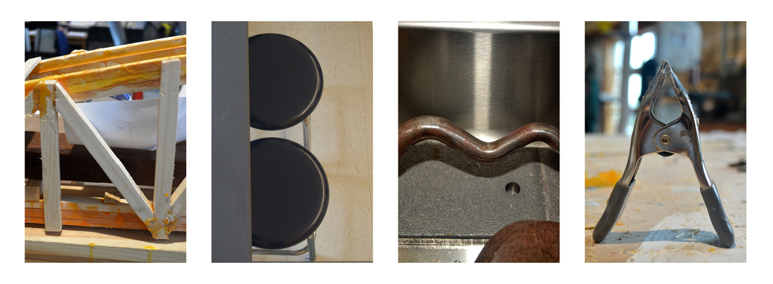
The word I created was NBMA which represents a skate shop in New Bedford, Ma. For the letter B I had to crop it more in photoshop and to set up the photo I stood on top of a chair and arranged the others closer to resemble a B and for the A I arranged the clamp to be upright and made it the main thing in focus in photoshop I brightened up the image so it could be more easily seen. I think the letter that has the most interesting composition is the A in just how the background is blurred but the letter is very clear and because it looks the most like the letter it's supposed to be. If I were to redo this letterform I would most likely spell out SBRHS because that would be more interesting to photograph in the school. You could spell out the word FOOD in the cafeteria or a kitchen.
